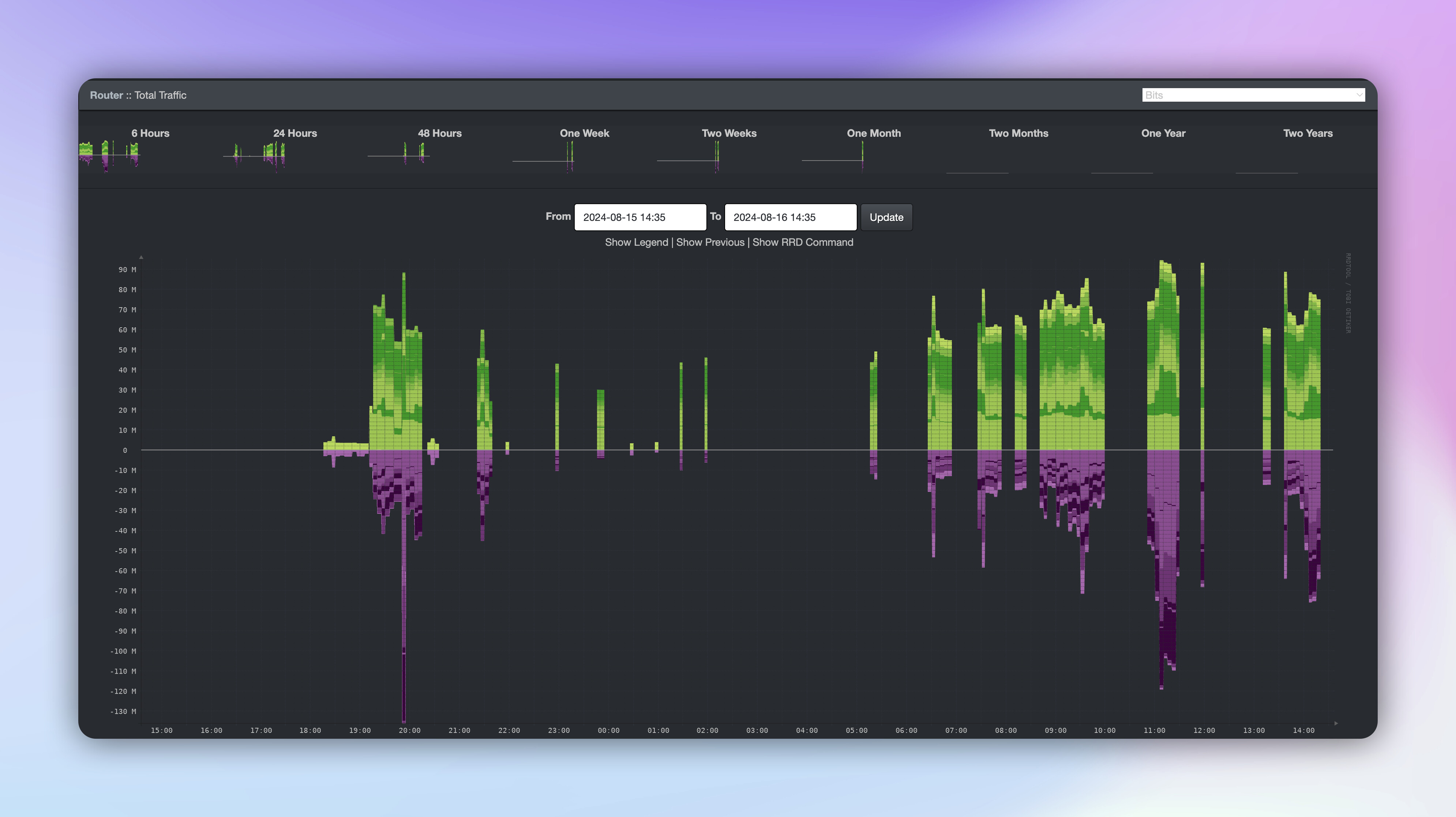
No idea if this will take on, or even if we have people who do stuff like this. But I would love to see peoples Data Visualisations on absolutely anything. I’ll kick it of with some Home Assistant, PRTG and SmokePing ones 
P.S. yes yes I know the pings ain’t great, Virgin Media for ya!
3 Likes
There’s a saying (not sure who by)
“Data is the new oil”
1 Like
Solarwinds is nice, shame they don’t have a free/homelab use tbh.
Hows Homeseer?
Very nice! Developers who put time into designing and creating lovely informational interfaces are worth every penny
1 Like
At a glance. But have pages of full datasets.
Roughly 2000 datapoints per minute.
Using predominantly Home Assistant and Grafana.
Very nice, what’s the wind speed tile? Don’t think I’ve seen that on Grafana before
I have used Nagios and the fork CheckMK. Currently got a NFR for PRTG so using that for now which seems to be decent. They have a plugin for Grafana as well. Feel like cacti hadn’t been updated in ages?
Never heard of NetDisco but netbox I’ve seen.
I did not know nPerf could do that!
Ah, the iOS version is about the same.
Don’t think iOS reveals the cell towers you are connected to mind you. Another Apple feature lol
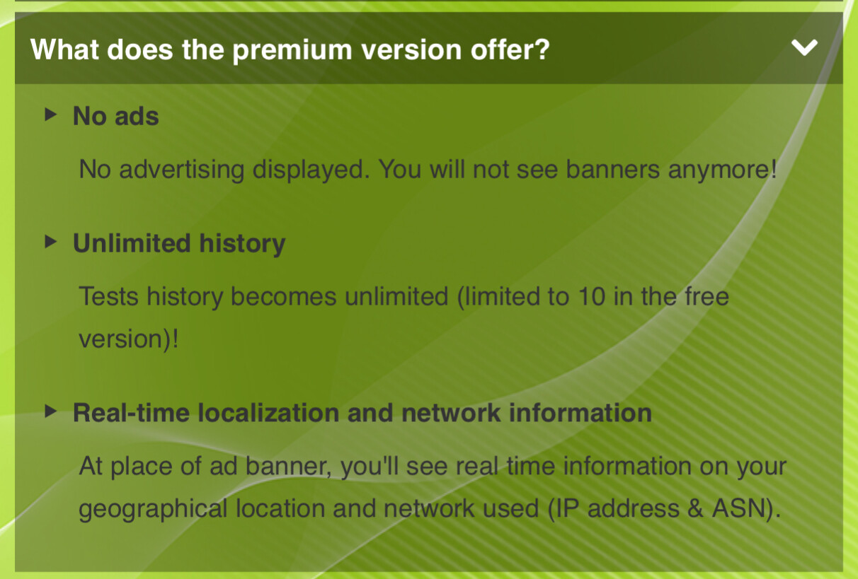
Ah could be, what else do you get in the full?
Found out
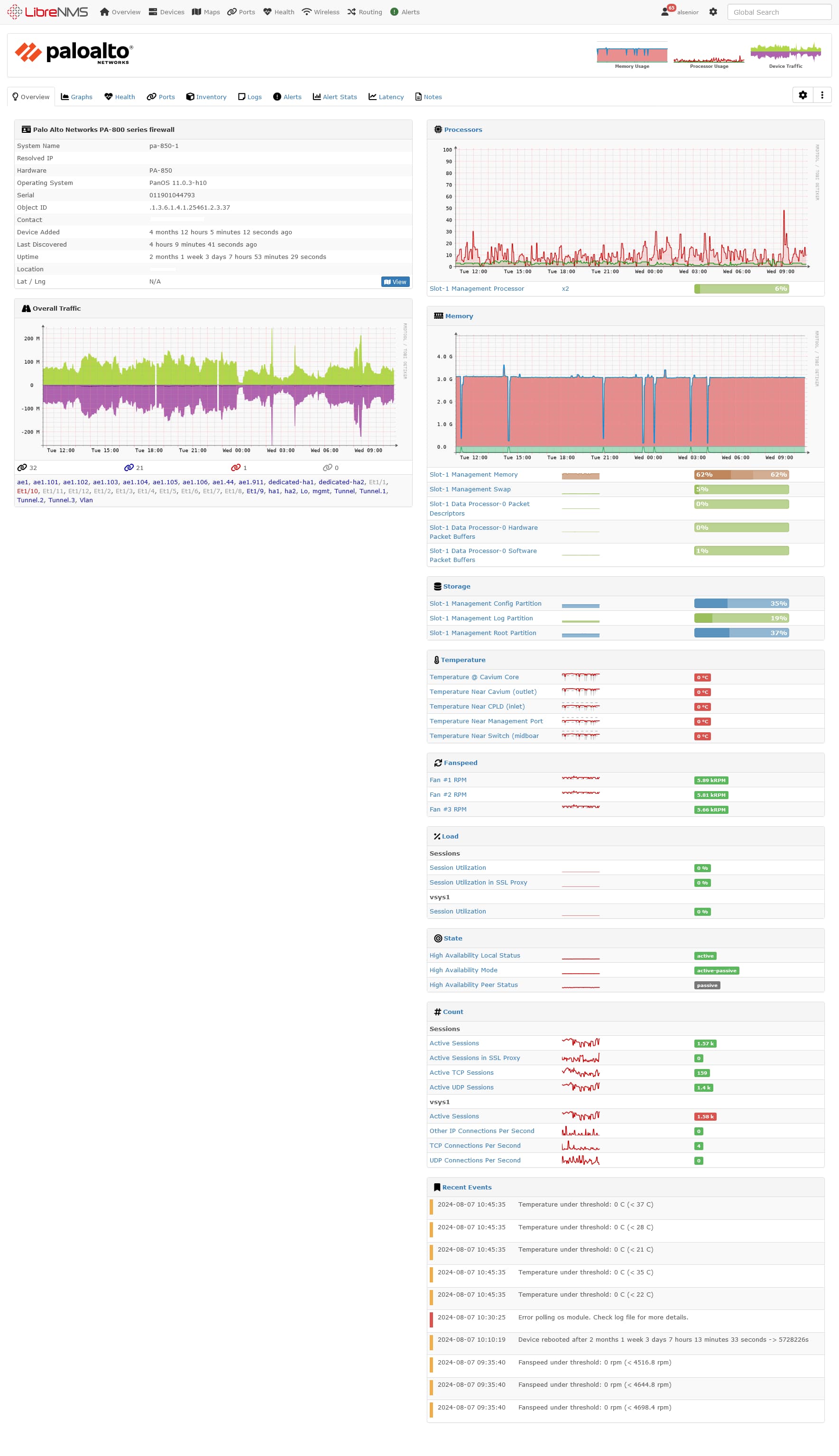
Not as nice as some peoples but keeping everything in Librenms has its advantages
Very nice, the dark mode on Libre is nice 
Id did not know Librenms had a dark mode. That is rather nice.
1 Like
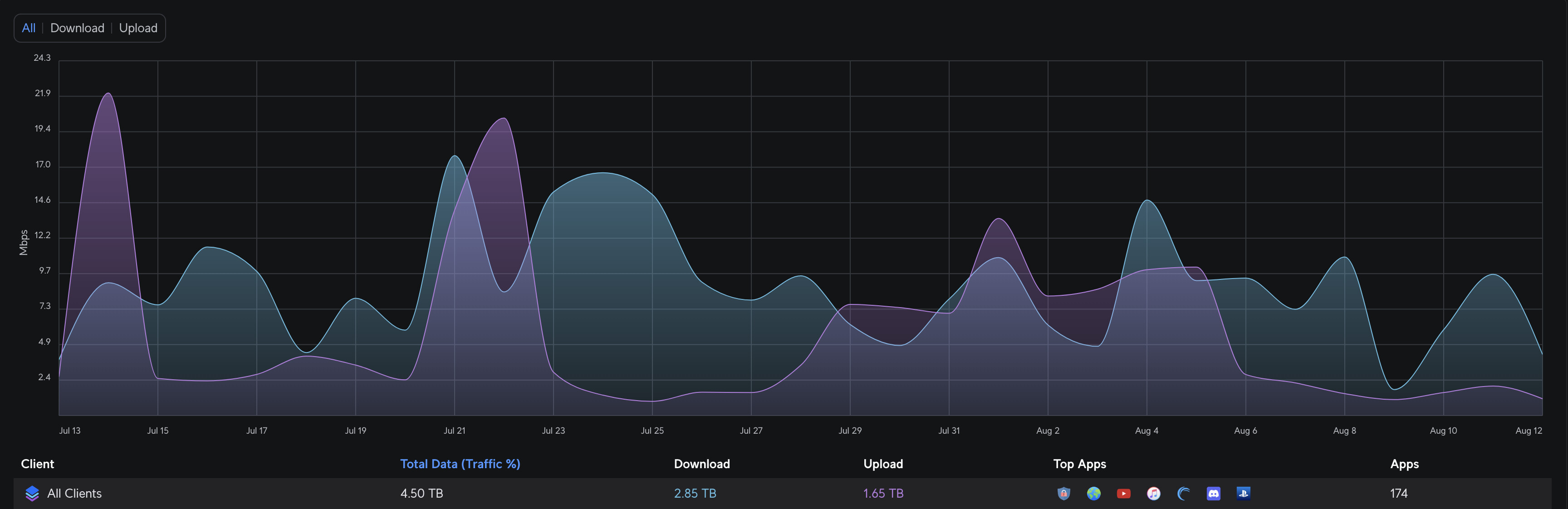
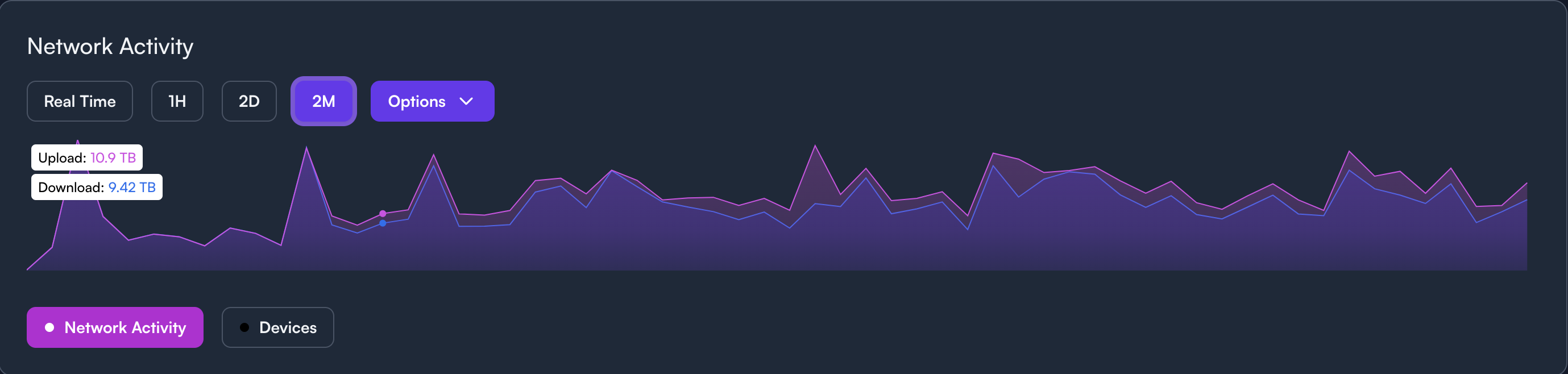
Theres always the standard UniFi Graph which is very clean
And Alta Labs
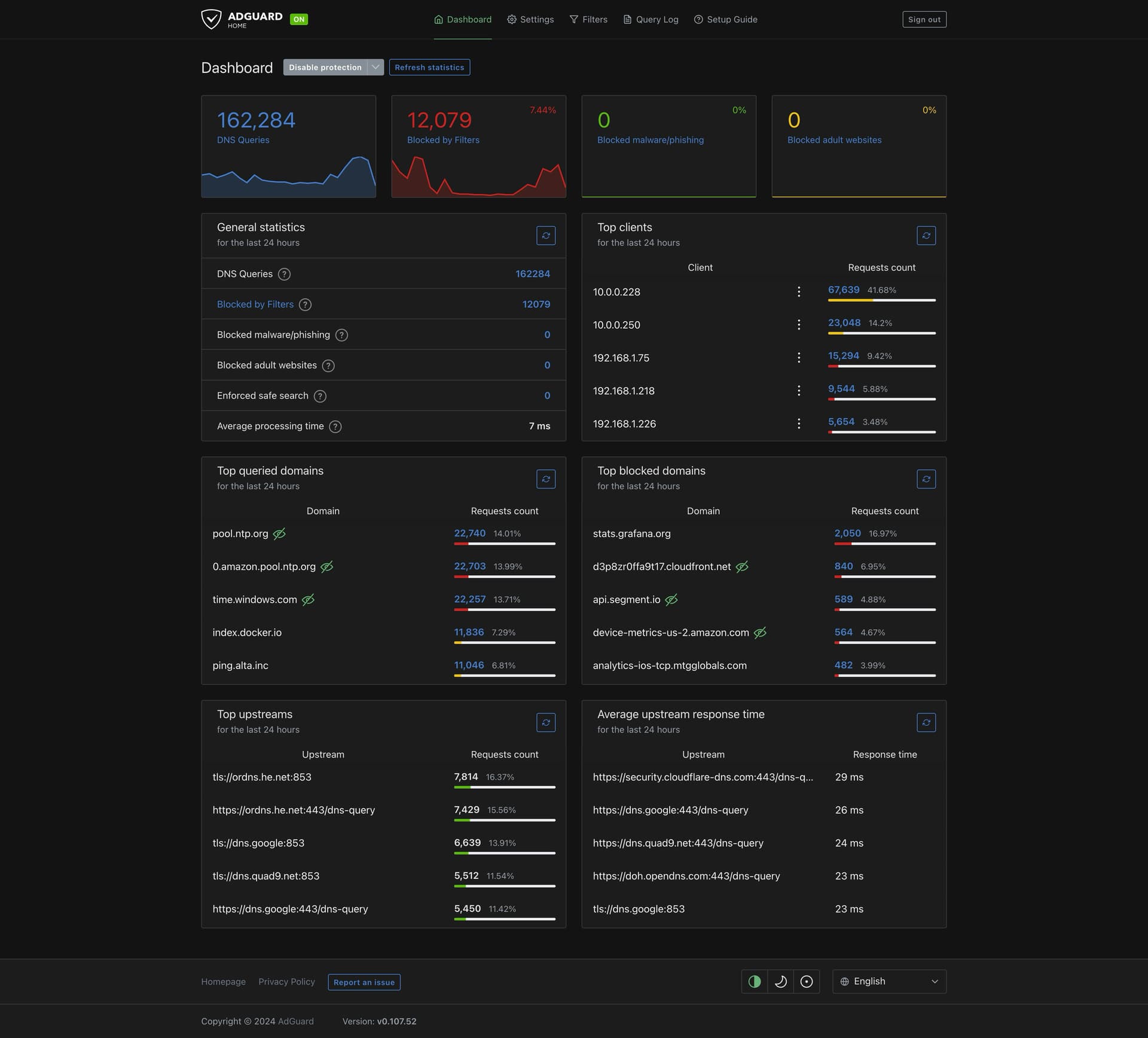
AdGuard Home
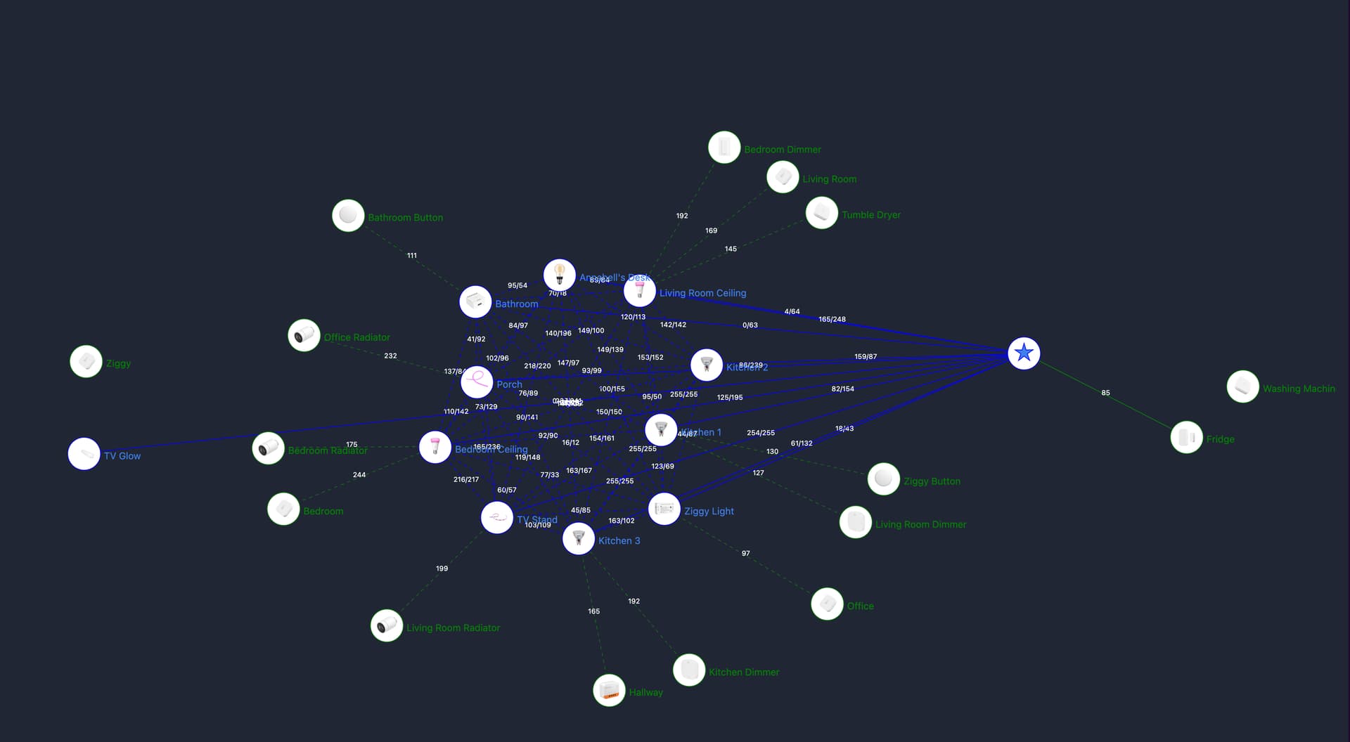
Zigbee2MQTT
It does depending on what the device is, like router or end device.
1 Like
I must admit, setting up LibreNMS again (used it before but didn’t 100% like it) made me realise it’s actually not to bad tbh.
Am going to give CheckMK another go to see how that looks.
1 Like